BobaComponents Codebase
For installation instructions check out Setting Up Your DevEnv.
Overview
The BobaComponents Codebase contains all the code pertaining to the BobaComponents component (demo). It's written in Typescript and React.
There are two important folders:
- src: where all the source code is.
- stories: where the "testing stories" (the one you see on the demo's left-hand sidebar) are defined.
Src Folder Structure
The src folder structure is victim of some accrued tech debt and not as well-defined as it could be. Overall it tries to follows the following rules of thumb:
- common: everything that's often reused throughout the UI. Buttons, Tags, Tooltips, etc. etc.
- post: everything that's related to posts. This includes threads and comments. It should probably be further split.
- List
Components Overview
Here is an overview of how the components in BobaComponents come together to compose the website structure.
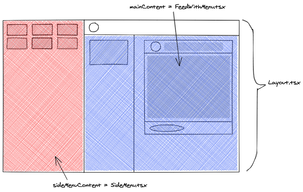
Layout Structure
layout/Layout.tsxis the main container of the whole BobaBoard website. It includes the header, and accepts props for sideMenuContent and mainContent, as indicated in the picture above. SideMenuContent is usually an instance layout/SideMenu.tsx, while mainContent varies across pages. In board and thread view, mainContent is an instance of layout/FeedWithMenu.tsx.
FeedWithMenu is also comprised of two parts: the sidebarContent and the feedContent. It also accepts a function onReachEnd which is called when the feed has been scrolled to the bottom. The sidebar is automatically hidden once the mobile breakpoint is reached, and will only be displayed again when the showSidebar props is set to true.
Post Structure
The component for regular, display posts is post/Post.tsx, which has the following structure:
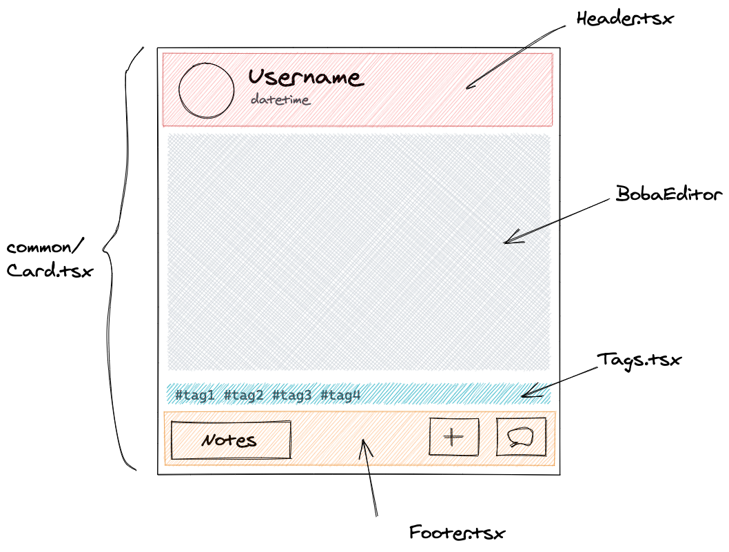
The component for the post editor is post/PostEditor.tsx , which follows a similar structure but swaps out Footer.tsx for EditableFooter.tsx.
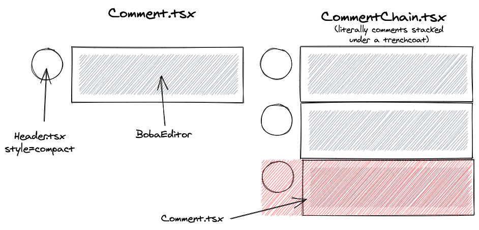
Comments Structure
There's two types of comments: the regular, single comment, and comment chains, which are multiple comments chained one after the other. These classes could probably be merged into one, which would be a great refactoring exercise for the willing.
Imperative Handler
Comments expose an "Imperative Handler", which is used for controlling actions on comments from external components. Imperative handlers can be accessed by using refs.
const handler = React.useRef<CommentHandler>();

// In component
<CommentHandler ref={handler} .../>

// In code, to highlight the comment
handler.current.highlight();
Threads Structure
The files you want are post/ThreadIndent.tsx for posts, and post/CompactThreadIndent.tsx for comments.
TODO: write this. The threads structure right now is a bit of a mess. If you want the unruly task of fixing it, I shall explain to you how to proceed. Beware.
Theming
Theming is... not great, right now. You might find some constant used throughout in theme/default.tsx, but this should likely be refactored to use CSS vars.
How to Add a new Component
To add a new component, you can use the following structure as a base:
import React from "react";
import classnames from "classnames";

import debug from "debug";
// This should follow the path of the folder you're putting this component in
const log = debug("bobaui:boards:boardsSection");

const SidebarSection: React.FC<SidebarSectionProps> = (props) => {
  log("this is a component sample!");
  return (
    <div
      className={classnames("sidebar-section", { editable: props.editable })}
    >
      Component Sample with {props.sampleProp}!<style jsx>{`
        .sidebar-section {
          font-size: large;
          color: red;
        }
        .sidebar-section.editable {
          color: blue;
        }
      `}</style>
    </div>
  );
};

// Types for props
export interface SidebarSectionProps {
  sampleProp: string;
  editable: boolean;
}

export default SidebarSection;
Storybook
We're currently moving to Storybook 6.0's arg-based stories, actions & controls. Any refactoring adding them in older places is appreciated. If you really want to overachieve, some Stories might also benefit from "building pages" or "multiple components".
Debugging
BobaComponents uses the debug JS library. To trigger debugging in the JavaScript console, you must set the value of the corresponding flag in localStorage by using one of the following commands within the console itself:
// Print all the debug logs related to the ui
localStorage.debug = "bobaui:*";

// Print all the debug logs minus those ending with -verbose
localStorage.debug = "bobaui:*,-bobaui:*-verbose";
Note: this codebase could use a lot more logging information! Feel free to add helpful notes.
Testing
This is currently done manually. If you'd like to set up a better solution you can refer to Implement Storybook Testing (Notion).