"Native" Gif Search
Problem Summary
The current dropdown menu component (whose current behavior can be seen here) only allows the display of "text + (optional) icon" options. In order to use it for GIF search (and, in the future, emoji/sticker selection), we need to expand it to include the ability to select between images.
Current Status
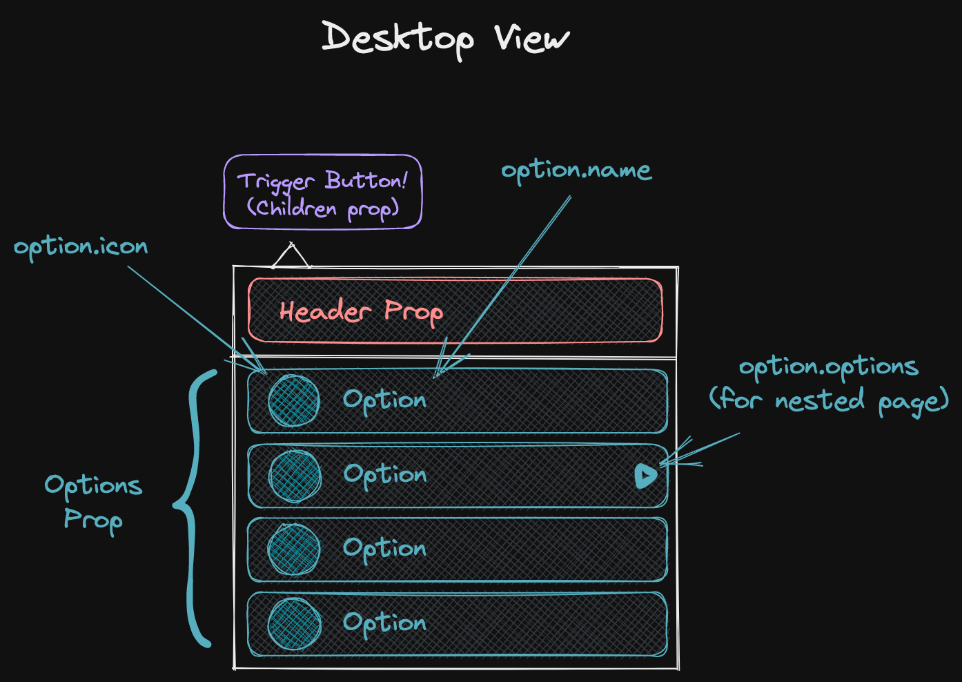
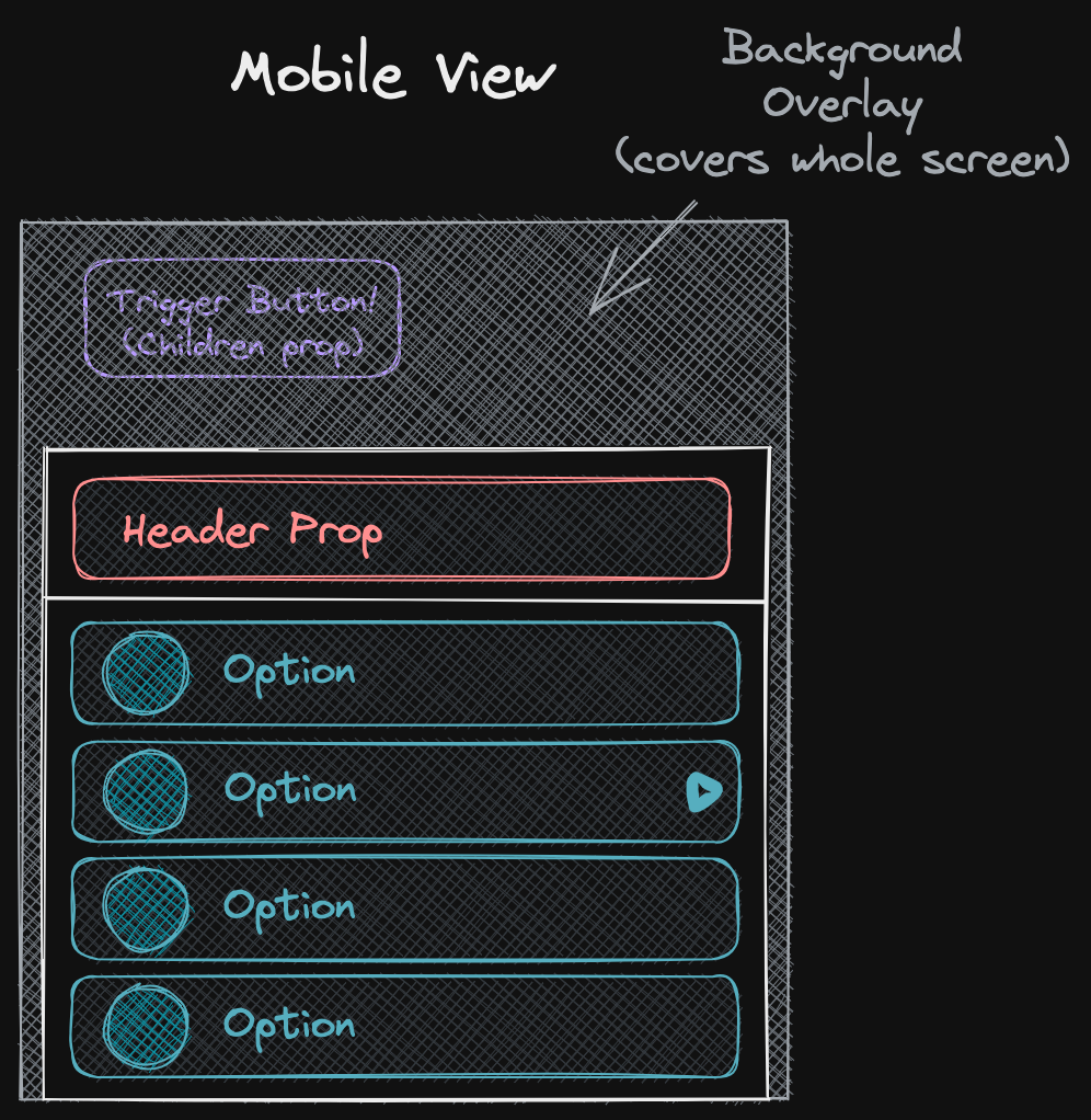
Component Props
interface DropdownProps {
  // The trigger button.
  children: React.ReactElement;
  // An extra component to optionally display above the set of options.
  header?: React.ReactElement;
  // An array of options to display within the dropdown. If no option is present,
  // the trigger button (children prop) is returned as is.
  options?: ({
    name: string;
    icon?: IconDefinition | string;
    color?: string;
  } & (
    | // Click action OR...
    { link: LinkWithAction }
    // ...the recursive set of options for the next page.
    | { options: DropdownProps["options"] }
  ))[];
  /* irrelevant stuff */
}
Desktop View

Mobile View

Final Result
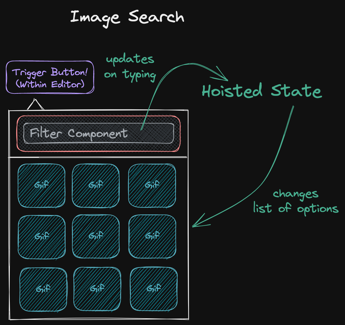
Mockup

Considerations
- Q: Can the same "selection page" be comprised of both images and textual options?
- No.
- Q: Can an image selection page be displayed AFTER a textual options page?
- Yes, and we can use the same
DropdownContent.previousOptionprop we already have coded to allow returning to the previous page.
- Yes, and we can use the same
- Q: Can "image selection" have multiple pages?
- Technically yes, but I would skip it for now.
- Q: Which "codebase" should be in charge of making requests to the gifs endpoint?
- This has historically been part of the editor itself. It will likely need to change, and I'll spend more brainpower on how once we're closer to tying everything up together. The initial component should not be tied to any particular image provider. Ideally we could reuse it for Tenor, Giphy or even our own internal search.
- Q: Do we want it to be simply image selection or also allow selecting videos (bc of the gif size vs mp4 size issue)?
- I guess we'll have to support passing videos for gifs, but I'd look at what react-tenor does.
- Q: Do we want a masonry-style display for images or a grid-like style one?
- React-tenor currently uses grid, and I'd keep it that way for now because it's easier.
- Q: What are the accessibility considerations for something like this?
- What happens if people pause automatic gif playing? Should they still be playing in the
selector?
- IMO, yes.
- Dropdown should have correct tab order (double-check) but is missing ARIA states. We can fix this if we want, but at least adding image selection doesn't make accessibility worse.
- TBD.
- What happens if people pause automatic gif playing? Should they still be playing in the
selector?
What We Have
- An example of a dropdown with filterable options in BoardSelector.
- A gif search component (Tenor Keyboard in the editor codebase) made by shamefully hacking React Tenor to suit our needs.
- If we want to have a masonry-style image layout we can reuse MasonryView.
Roadmap
- Change DropdownListMenu to allow a series of images as a potential option.
- Create an
ImageSearchcomponent that wraps a DropdownList + a filter, and potentially allows choosing between a changing list of suggestions (like in react-tenor). - Decide the data flow from user input to the display of the correct list of images for GIF search.
- Implement the right calls to the Tenor API.
- Change Editor to call to an external component for GIF search.
- Example branch of how this could be done by using context.
Proposed Code Changes
Current
interface DropdownProps {
  // The trigger button.
  children: React.ReactElement;
  // Am extra component to optionally display above the set of options.
  header?: React.ReactElement;
  // An array of options to display the dropdown. If no option is present,
  // the trigger button is displayed as it is.
  options?: ({
    name: string;
    icon?: IconDefinition | string;
    color?: string;
  } & (
    | // Click action OR...
    { link: LinkWithAction }
    // ...the recursive set of options for the next page.
    | { options: DropdownProps["options"] }
  ))[];
  /* irrelevant stuff */
}
New
Text Option Types
interface TextOptionWithLink {
    name: string;
    icon?: IconDefinition | string;
    color?: string;
    link: LinkWithAction;
};

interface TextOptionWithNesting {
    name: string;
    icon?: IconDefinition | string;
    color?: string;
    options: DropdownProps["options"]
}

interface TextOption = TextOptionWithLink | TextOptionWithNesting;
Image Option Type
interface ImageOption {
  // If we support video, we likely need to add another option here.
  image: string;
  // For accessibility reasons?
  name?: string;
  // This could just be "onClick" if we don't support "open in a new page".
  link: LinkWithAction;
  // Note: images don't support nesting.
}
Final Dropdown Type
interface DropdownProps {
  /* All the same*/

  // Note: array of images OR array of texts, not mixing them together in the same list.
  // Other note: having a ImageOption[][] would easily enable multiple pages of images,
  // but this doesn't help us for GIF search cause we don't want to fetch all the pages
  // at the same time, so we'd still have to figure out how to do it only on request.
  options?: ImageOption[] | TextOption[];

  /* irrelevant stuff */
}
Component Code
I think the easiest way of doing this would be to have two separate DropdownContent implementations, one for TextOption[] and one for ImageOption[]. DropdownContent can then be a mostly-empty wrapper that just delegates to DropdownImageContent or DropdownTextContent according to the type of the options array. This means DropdownMenu's code won't have to change.
I think it might make sense to also move the Dropdown code to its own folder and split components in their own files.